Thoughtful, innovative web design creates a memorable and unique feel for any website. Draw in your audience with standout graphic design, web design or even the design of a logo. In return, visitors can expect a more interesting and rewarding experience than the one offered by a flat page. When you add depth, you can highlight certain unique elements thatwill aid in the creation of correct hierarchy designs.
If you’ve been wondering how to create depth in web design, then we’ve got you covered. Learn five design tricks and trends, explore the details of 3D features, and get tips on how to maintain a healthy design balance. Armed with this advice, you’ll be ready to tackle any design project!
Realistic Interfaces

An effective yet conventional way to create a sleek design is by implementing realistic, pressable buttons that give the impression of actual interaction. A few sleek effects added to a button will attract the visitors’ attention… But don’t overuse gradients, shadows and other elements that smother your page. A 3D button will stand out against a regular link positioned next to it and will most likely give it a higher usage priority.
But realistic interfaces can be a bad idea if overused. Far from making your design look smooth and user-friendly, the application of too many gradients and drop shadows can crowd your page and make it unapproachable.

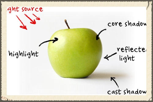
 Before you create your successful interface elements, take a moment to conceptualize them. Imagine how your button will look like from a side viewing point, from straight viewing point and, most importantly, what direction the light that provides the shadow is coming from. 3D elements are useless is they are not realistic; even worse, they will ruin your entire design. Therefore, it’s really important that you ensure your design has a lifelike element.
If you are interested to learn more about the theory and best practices behind the creation of 3D elements, Crafting Subtle & Realistic User Interfaces is a great tutorial about depth-in-design. Also, you can find more step-by-step tutorials and examples of full web design interface, button elements and other realistic interface elements on PSDTUTS.
Wrapping and ribbons

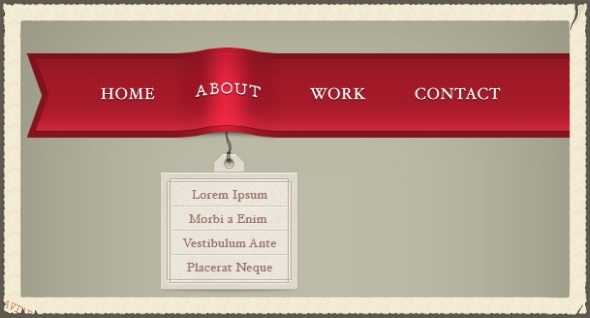
The ‘wrap around’ technique gained enormous popularity in the past couple of years, and it’s little wonder why. The effect can create impactful visual effects for any depth in most designs, plus it draws the visitor’s attention to a specific area of your page.
You can create various wraparound looks, from the solid folded look to a rounded, softer look; it all depends on the general design of your pages. For more examples, take a look at Showcase of 3D Elements in Web Design, where you can find lots of these elements.
The ribbons are usually used to highlight important parts of a web page. They can be used for headlines, blog dates, featured items, or anything else that you need to stand out. People often use them for the Sign Up or Contact sections. Also, some designers use ribbons or wrap around to generate depth and create elements separation in a full site.
A great tutorial for softer and rounded wrap around is Create a Web Layout with 3D Elements using Photoshop. For a common folded wraparound, take a look at Create a 3D Ribbon Wrap-Around Effect (Plus a Free PSD!).
Perspective

Perspective adds depth in an impactful and visually appealing manner. Unlike other design depth techniques, perspective is not subtle. Instead, it is used to make the design more interesting, create a memorable effect, and, in the end, give the visitors a distinctive experience.
 There is no formulaic approach to this type of design. In fact, it’s rather unique from one designer to another, as it can come in many different shapes and interpretations.
Think back to art classes you took in school. Remember how you had to create horizontal alignment and follow consistent angles to ensure that the image looked correct? Remember how you had to balance the right proportions regarding size ratios and angle alignment across a horizontal space? Those guidelines can also be applied in perspective design.
Perspective design provides realistic interfaces and depth. It also brings the focus to a certain or main element in your webpage. Above all this, perspective design can direct the user to a specific point of interest from your page.
Want to see some examples? Check out meomi.com, a cartoon-like website, acko.net, for a more abstract design, or marcsdesign.com, for a more realistic approach.
Breaking the grid

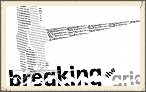
It’s possible to achieve depth without drop shadows, curves or gradients. Simply overlap the grid or place elements over or under one another to achieve the effect. Churchoftheking.net is using such a technique, creating depth by overlapping the content area on the rest of the page. It is a simple design, but very creative.
Also, another website that uses flat elements to create depth is prettyproduction.com. They overlap a few pieces and create something visually stunning very interesting from a simple base.
For another unique design approach, consider using flat elements to create depth. Imagine an aerial picture of a writing desk. Picture papers spread around, one on top of another, perhaps even with a coffee mug on top of one pile. These overlapping objects will create depth for your whole design, and in addition, if the coffee mug is just a bit over the page header, even more depth to create interaction.
Playing with shadows

The use of shadows is a very popular trend. They can be used to create a subtle effect, and to create wrapped pages, floating elements and other creative effects that will make your website unique.
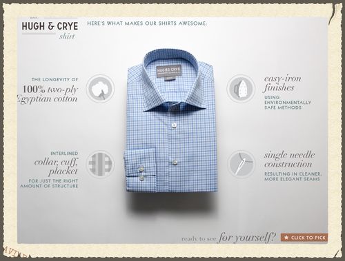
A very good example of floating elements that use shadows is Hugh & Crye 'The Shirt' banner. Check it out for better understanding of this concept.

Another example could be emotionslive.co.uk. By using rounded shadows below and element, the designed can create a 3D impression… Even if the design is flat. Using just a photo and a shadow, you can create a realistic visual.
Depending on the position of a light source, the shadows can make a flat element look like it stands up. To achieve this, you can use subtle colour gradients on the sides of one element and small realistic shadows below it. This can also be applied to the whole page design, as it will affect different textures or mimic shadows on certain surfaces.
The trend of wrapped shadows is a relatively recent phenomenon. It offers a way to add depth easily, without modifying the structure of a page too much. To see what this is all about, check out Warping Drop Shadows to Give Depth. You can also use this technique to create points of interest. Depth is a great tool in web design, enabling visuals to be more impactful and memorable. Armed with these tips, you can implement it in your own designs to create a standout website.
